Picking Images
Image pickers come in a few varieties. One of the most common ones is the standalone image picker component. For example, the ‘Logo' picker within ‘Menu and Navigation':
Another image picker exists within list items, such as the Price List module:

As you can see, their design matches closely, as does their functionality. Thus, even with components being in different places, we will always strive to keep them recognisable and all functionality the same.
Changing an image
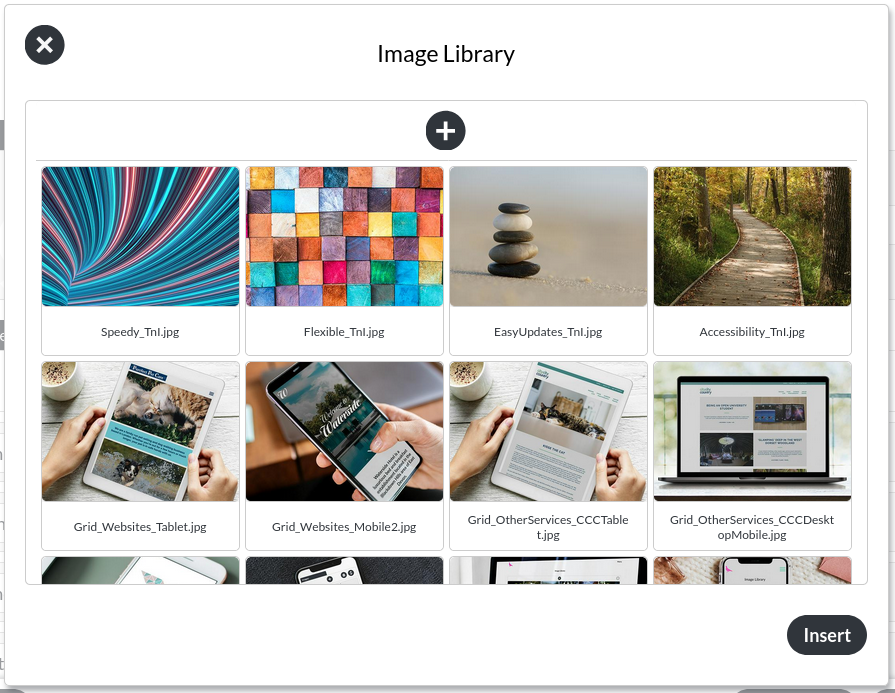
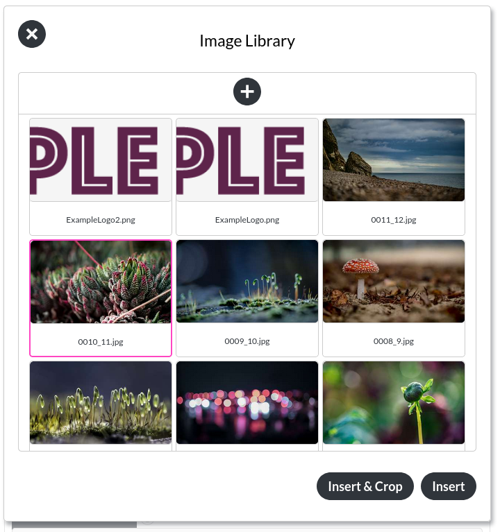
When you click anywhere on the image (not just the circular icon in the lower right), the image gallery overlay opens, allowing you to select a new image. This is what the image gallery overlay looks like:

If you had already selected an image previously, this image will be highlighted with a pink outline. If not, then clicking any image will add the pink outline, marking it as selected for insertion. When you select the ‘Insert'-button, the image you selected replaces the one that was shown in the component before.
Just selecting a new image does not save your change. You still have to select one of the save buttons at the bottom of the page. This will make the new image show up in your preview site.
Uploading a new image
From within the image library overlay, you may also upload images directly. To do this, you need to select the ‘add' button:

This will open a file browser (which will be different for every operating system / device), where you may select an image up to 2MB big. We support .JPG, .SVG, .GIF and .PNG images. Any image above 512kb will be compressed, to ensure your website stays fast for your visitors.
Cropping an image

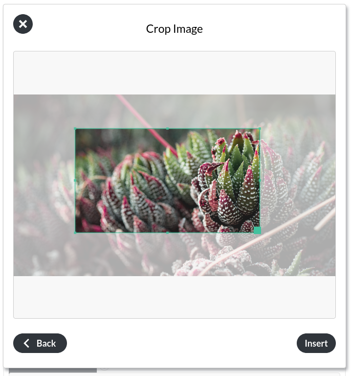
If you want to define a new crop for an image, you may select ‘crop insert', to define an area of the image to use within your module.

Alt text

Most images need to have a so-called "alt text", which is a text-only placeholder, shown when an image does not load, or read out loud by screen readers. This means it is essential for accessibility.