Website Essentials
The website essentials are a collection of settings that affect the most basic parts of your website. Depending on the type of access you have, you can change many of the fundamental visual attributes of your website here.
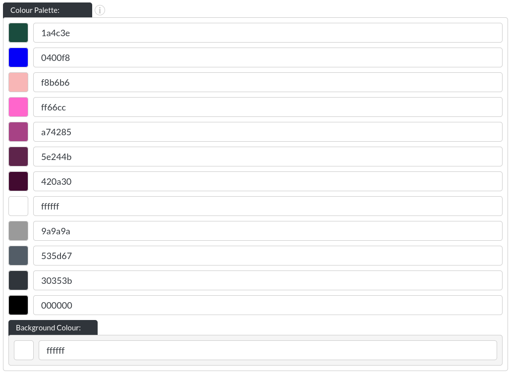
Colour Palette
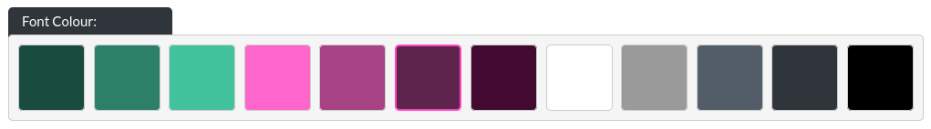
Here you may define up to 12 colours to be used with your website. If you change a colour, it will automatically be changed on the whole website. For example, where it says "ffffff", this is the so-called hex-code for the colour white. (You can read more about hex codes here. If you want to find hex colours, this website is quite useful), if you were to change this to another colour, all parts of the website using this white field, will change to the new colour you have assigned. (If you have two white fields in your colour palette, only the one specifically assigned to elements in the website builder changes.)
If you are interested in getting colour palettes, this site is a great resource.
Colour Templates
A colour template records a specific setting for various standard module colours, such as font, background and CTA (button) colours.
This can reduce a lot of the effort in creating websites with alternating colour styles, as you now only need to select the colour template, instead of setting all colours individually.
As soon as you have defined a colour template and saved the ‘Essentials' module, all modules will show the colour template options available.
Template Name
Before a colour template can be saved, it needs to be given a name. We tend to use this functionality for having different font and background colours, so templates are often called something like ‘Red background, white font' and then the reverse.
Colour Values
These colour values correspond to the same values in each module that has these values available. If a partial match is found, only those colours will be applied when selecting the template.
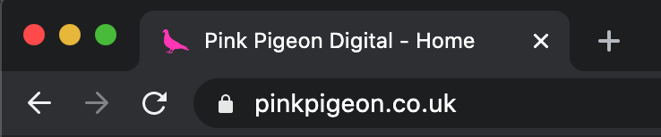
Favicon
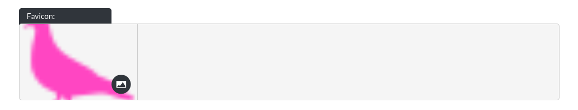
The so-called ‘Favicon' is a small logo, which will show up in browser tabs, or on the home-screen of mobile devices (if someone was to add a shortcut to your website on their mobile phone, for example). Supported formats are .png, .jpeg / .jpg, .gif format. Technically, .ico, .svg and .bmp are supported by some browsers, but can't be guaranteed to work universally.
Example:
Text Options
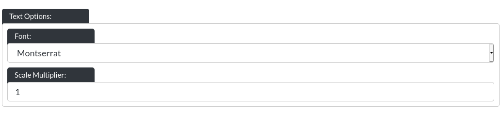
Within the text options you may choose the font for your website. We offer 9 different fonts at the moment (and may offer more in the future). Fonts have very different levels of legibility, making it very important to ensure your website is easy to read. Often, unless needed specifically for artistic purposes, it is best to choose a simple, plain font (for example, Lato, Raleway, Montserrat, Roboto or Open Sans). There is an additional option called "Scale Multiplier", which allows you to make the font on your website bigger or smaller.
It’s best to experiment with the different fonts, which is easily done thanks to the realtime feedback our previews offer.
Buttons
All buttons on your website can be customised. Any setting here will affect all buttons at once, not individual buttons.
- Corner Style: Buttons can be set to have sharp corners
 , semi-rounded corners
  , or fully rounded corners
  .
. - Fill Transparency: When set to transparent, the background colour of the module the button is on, will ‘shine through' the button. The button's text (or label) and border remain visible (and the colours, including the rollover remain customisable). All buttons in the bullet point above are transparent. An opaque button looks like this:

- Chevron: All buttons can have a so-called chevron, which is a visual element to indicate that the button is a link leading somewhere else.
- Font Case: You can pick between all buttons being labelled with lowercase letters (as shown above) or uppercase letters, like this:

Search Engine Settings
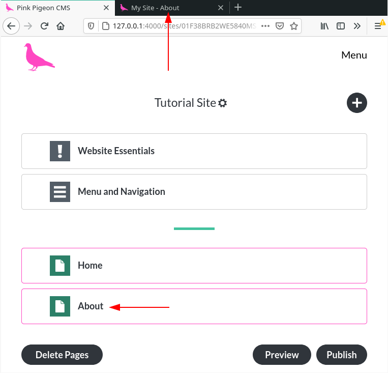
- Site Title:
Here you can define a site title, which will be used by search engines (like Google). This will be the name of your site, shown in browser tabs, throughout:
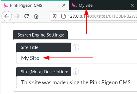
For any pages of your site, the page's name will be appended to the site title.
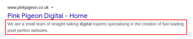
- Meta Description:
This is a (short) bit of copy, which is used by Google and other search engines to show what your page is about in the search results. For our own website, it looks like this on Google (This bit of text will never be visible to visitors of your website, it is exclusively used by search engines.):
Social Share Settings
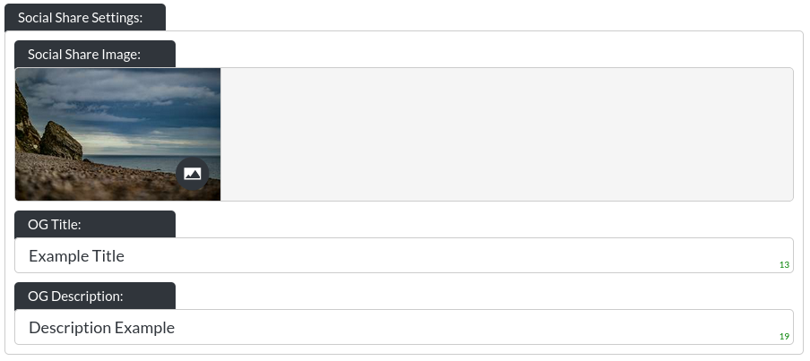
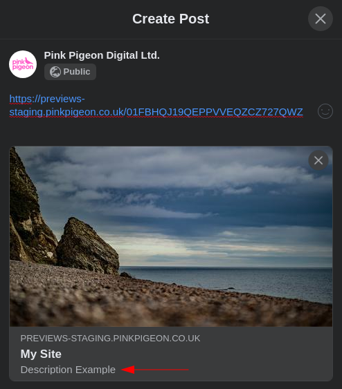
Social Share Image
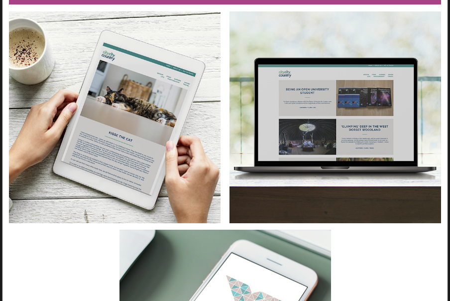
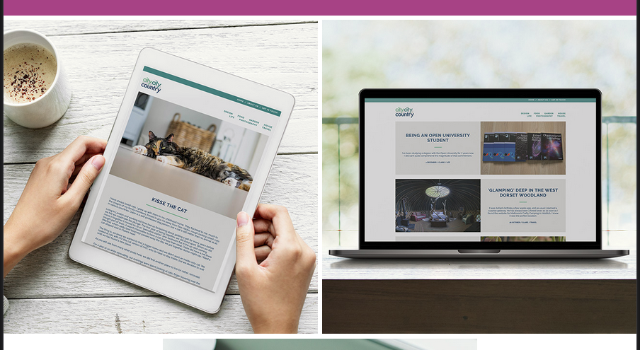
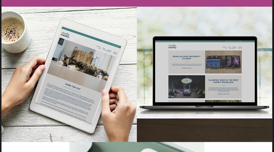
This is the image which is shown when someone shares your site on Facebook, Twitter, Telegram, etc. Here is an example of what this looks like on a few different platforms:
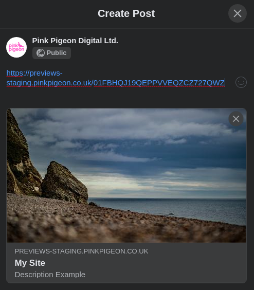
OG Title
This is the title to be shown as part of social shares:
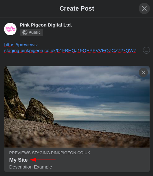
OG Description
This is the description to be shown as part of social shares:
Footer
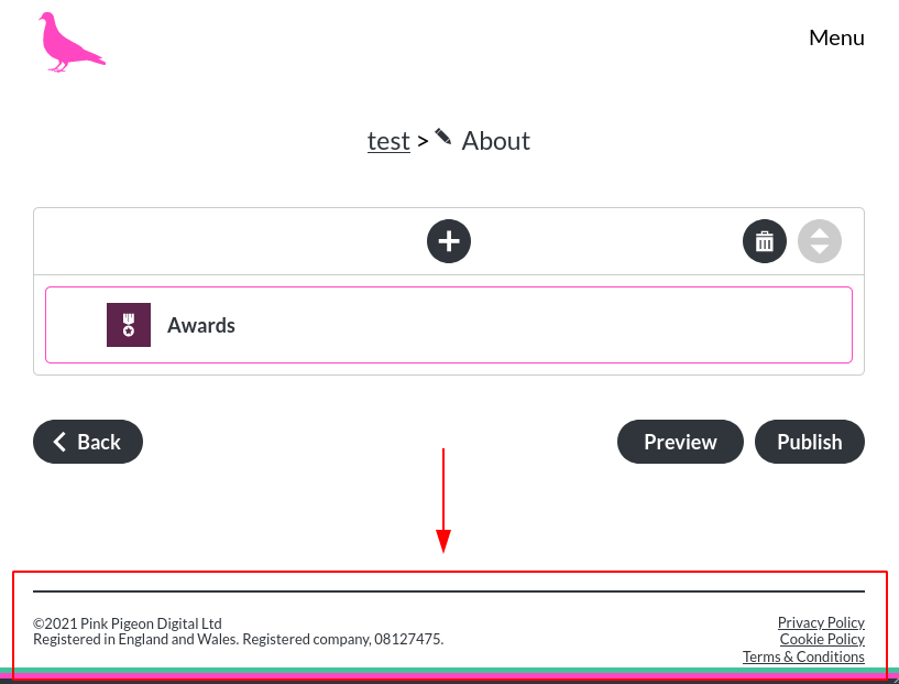
The footer section looks as follows:
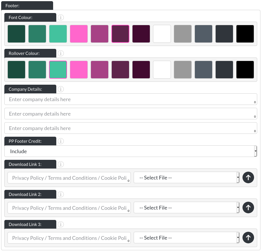
The footer section allows you to edit:
- Font colour: Controls the colour of the text within the footer.
- Rollover colour: Controls the rollover colour of the text within the footer.

-
Company Details: In the UK, these are the typical three pieces of information, included on most companies' websites. E.g. the company name, which countries the company was incorporated in and what the company number is. If either of these fields does not contain any text, the website builder will remove that line and close the space it left automatically. The final result online looks like this:

-
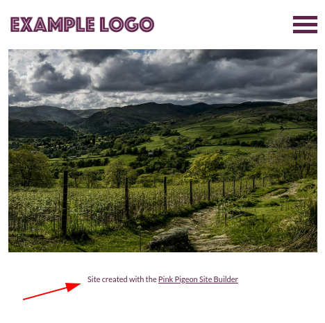
(Gold Users Only) PP Footer Credit: If you are a gold user, you can choose to remove the Pink Pigeon Site Builder note in your site's footer.
- Download Links 1-3: Here, using the up-arrow icon (
 ) you may upload a .PDF (recommended) or .TXT file (you can upload other file types) up to 2MB big. For larger files you will have to contact us. The files will be shown using the description you enter into the left field. See here how "Special Thanks", "Privacy Policy" and "Cookie Policy" are displayed on our own website:
Module Spacing
The modules on your website can have:
Large gaps:
Small gaps:
No gaps:
Fade In
When this option is enabled, your website's modules will fade in as visitors scroll down your site. Once a module has faded in, this will not repeat until the site has been refreshed.
This is not using lazy-loading, so your entire site is still loaded when first visited.