Text And Image - Feature Singlet
This is a special version of the Text and Image module, called the "Feature Singlet", which allows for a special shape to be applied to the image side of the text and image module. For example:

Enabling / Disabling
Like all modules, this module can be enabled / disabled. Please see the corresponding section of the documentation to find out more about this functionality.
Text Alignment
There are two options:
- Left:
This aligns all text to the left.
- Centre:
This aligns all text to the centre, except for bullet points, which remain left-aligned.
Image Panel
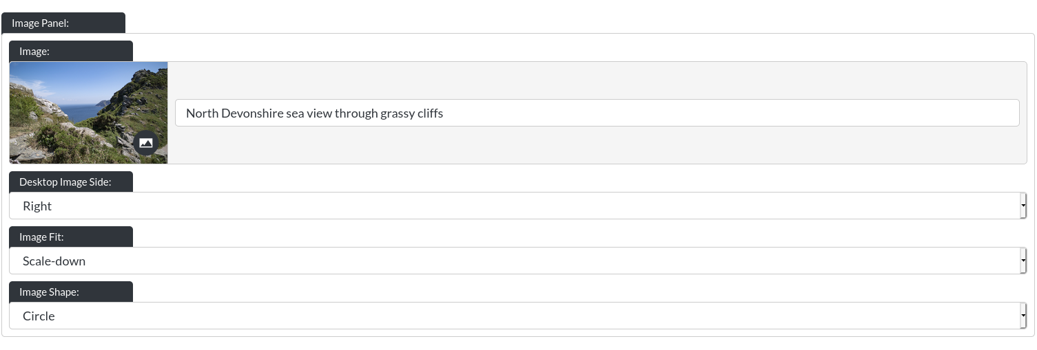
-
Image: This controls the image of the text module, for example:
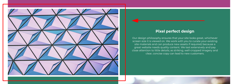
-
Desktop Image Side: You can ‘flip' the text and image around, for example:
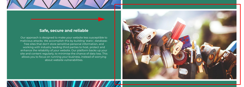
-
Image Fit: Because the images in this version of the Text and Image module are within a smaller space, we have added further controls over the ‘image fit', which allows for two options, "Cover" and "Scale Down".
"Cover" ensures the image always fills the space, like so:

"Scale Down" will shrink the entire image to the space it fits within, please see the example:

- Image Shape: Here you may pick from "Circle", "Rounded Corners" and "Square". Examples (excluding circle, as this is shown above):
Rounded Corners:

Square:

Text Panel
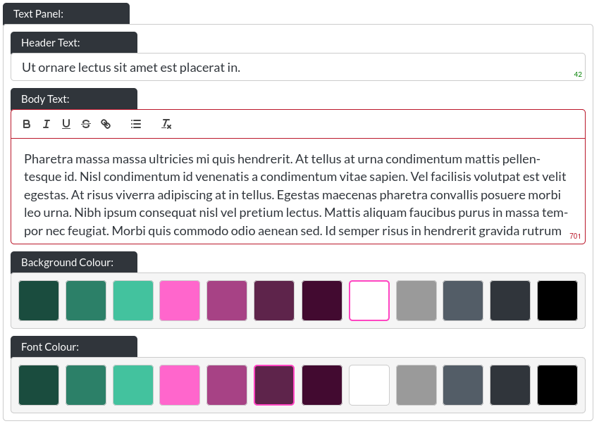
- Header Text: This is the header within a text and image module:
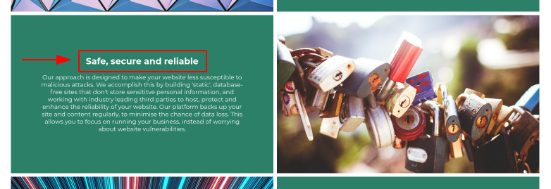
- Body Text: This is the body text within a text and image module:
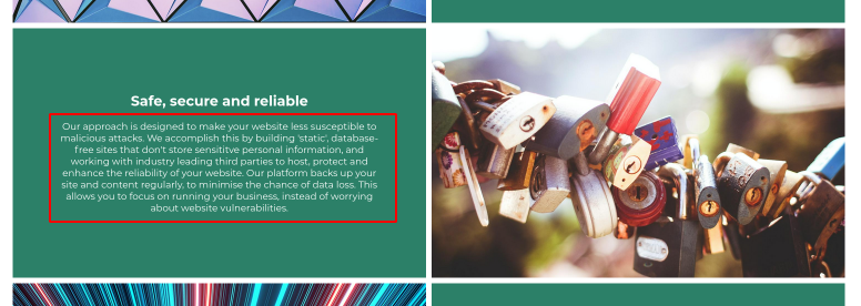
Please note that this is a rich text field. More info on that here. On desktop resolutons, this field has a height limitation, to ensure clean layouts, which is why the character limit is 450.
You can leave any text field blank, and the website builder will adjust the layout to make the remaining text elements fit. You could even leave all text out, if desired.
- Background / Font Colour: You can control the background colour and text colour of text and image modules using these controls.
Button
Please refer to the CTA / Button section for more info about the button.