Text and Gallery
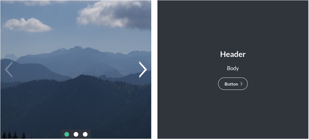
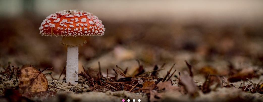
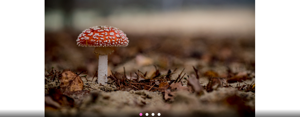
The Text and Gallery module combines an image gallery with a text panel. The images change, but the text remains the same. See an example below:
Enabling / Disabling
Like all modules, this module can be enabled / disabled. Please see the corresponding section of the documentation to find out more about this functionality.
Text Panel
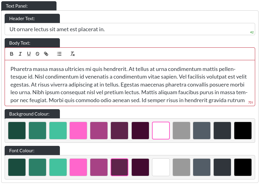
- Header Text: This is the header within a text and gallery module:

- Body Text: This is the body text within a text and gallery module:

Please note that this is a rich text field. More info on that here. On desktop resolutons, this field has a height limitation, to ensure clean layouts, which is why the character limit is 450.
You can leave any text field blank, and the website builder will adjust the layout to make the remaining text elements fit. You could even leave all text out, if desired.
- Background / Font Colour: You can control the background colour and text colour of text and gallery modules using these controls.
If a small or large module-gap was selected, the text and gallery module takes this into account, see Module Spacing in Essentials for more information.
Gallery Panel - Images
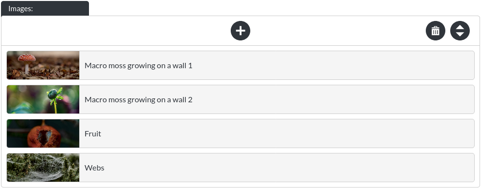
Here you may add / re-order / remove images from your gallery. Please note that the images start out in a compact state, like this:

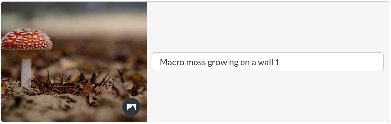
These items expand when clicked:
Selecting the ‘collapse'-button will make the item compact again. 
Gallery Panel - Image Fit

The image fit option allows you to specify whether your gallery should try to ‘fit' the whole image into the space of the gallery (‘cover'), or shrink the image within the space. This is easiest to see visually:
Cover
Scaledown
Gallery Panel - Auto Scroll

By default, a gallery automatically scrolls through its images at a set interval.
Gallery Panel - Scroll Interval

You can define how quickly the images of the gallery change, in milliseconds. Therefore, 4000, for example, is equivalent to 4 seconds.
Gallery Panel - Background Colour
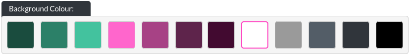
You may customise the background colour shown when using ‘scale down' as an image fit option.
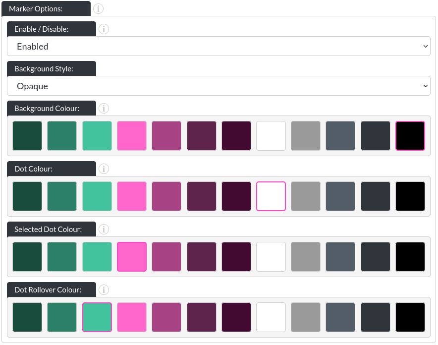
Gallery Panel - Marker Options
-
Enabled / Disabled: You can turn off the markers entirely, if desired.
-
Background Style: There are three options for the marker backgrounds. None:
 / opaque (with a customisable background colour):
 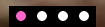 and ‘gradient', which you can see above.
 -
Dot Colour: This allows you to change the colour of the dots in their initial state (in above images, that is white).
-
Selected Dot Colour: This allows you to change the colour of whichever dot corresponds to the image that is currently showing.
-
Dot Rollover Colour: This is the colour of any dot that the user's mouse is hovering over.
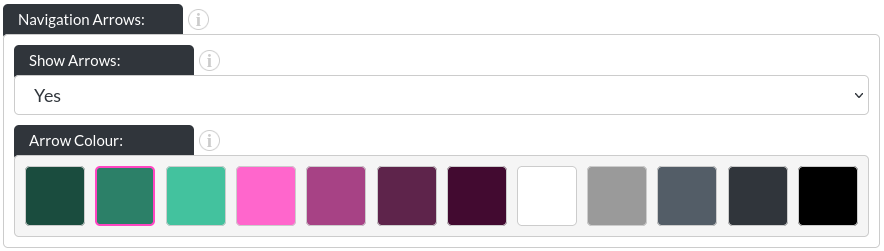
Gallery Panel - Arrow Options
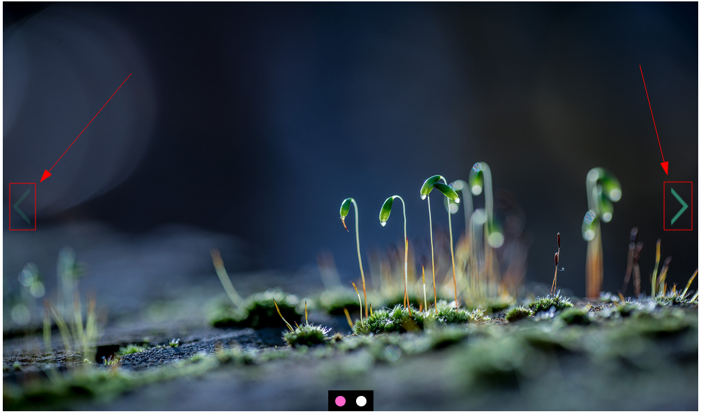
- Show Arrows:
You can enable or disable the arrows. Here is an example without arrows:

- Arrow Colour:
Button
Please refer to the CTA / Button section for more info about the button.