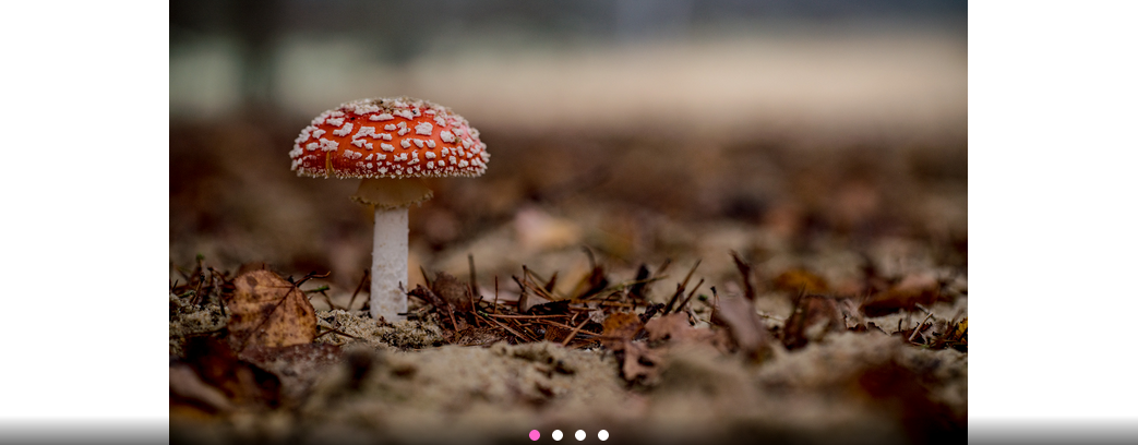
Gallery
The gallery module lets you add up to 8 images into a so-called image carousel, which can be swiped on mobile (or visitors to your site can use the provided buttons to select the images).
Grid Version
There is a grid variant of this module.
Enabling / Disabling
Like all modules, this module can be enabled / disabled. Please see the corresponding section of the documentation to find out more about this functionality.
Images
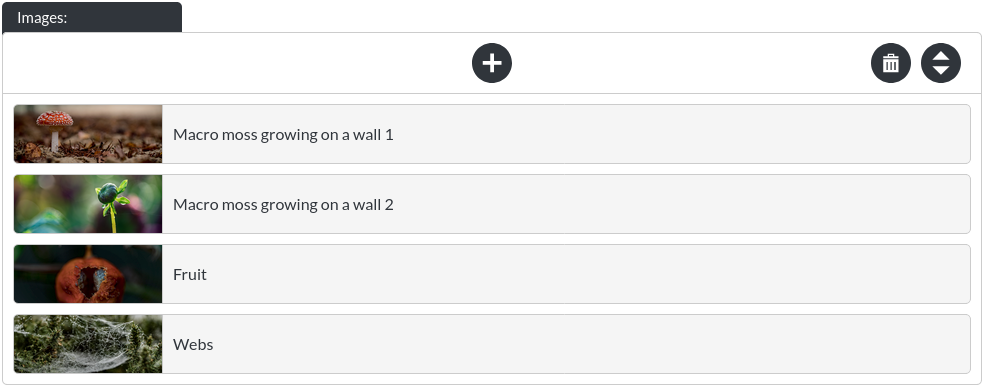
Here you may add / re-order / remove images from your gallery. Please note that the images start out in a compact state, like this:

These items expand when clicked:
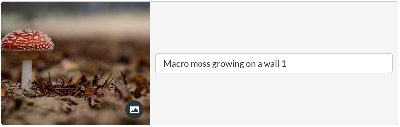
Selecting the ‘collapse'-button will make the item compact again. 
Image Fit

The image fit option allows you to specify whether your gallery should try to ‘fit' the whole image into the space of the gallery (‘cover'), or shrink the image within the space. This is easiest to see visually:
Cover
Scaledown
Auto Scroll

By default, a gallery automatically scrolls through its images at a set interval.
Scroll Interval

You can define how quickly the images of the gallery change, in milliseconds. Therefore, 4000, for example, is equivalent to 4 seconds.
Background Colour
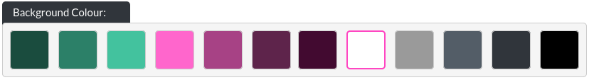
You may customise the background colour shown when using ‘scale down' as an image fit option.
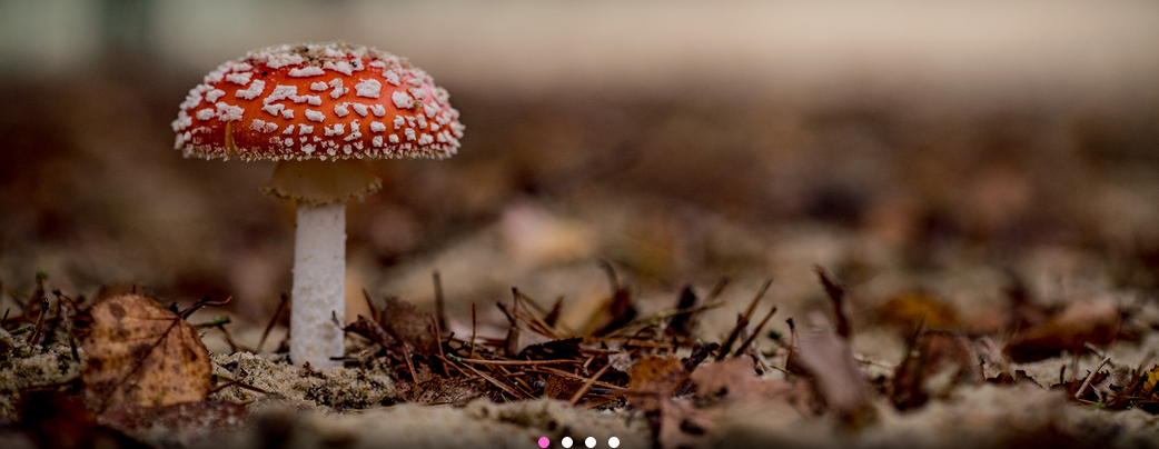
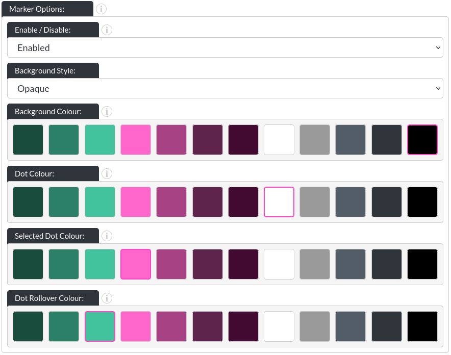
Marker Options
-
Enabled / Disabled: You can turn off the markers entirely, if desired.
-
Background Style: There are three options for the marker backgrounds. None:
 / opaque (with a customisable background colour):
 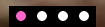 and ‘gradient', which you can see above.
 -
Dot Colour: This allows you to change the colour of the dots in their initial state (in above images, that is white).
-
Selected Dot Colour: This allows you to change the colour of whichever dot corresponds to the image that is currently showing.
-
Dot Rollover Colour: This is the colour of any dot that the user's mouse is hovering over.
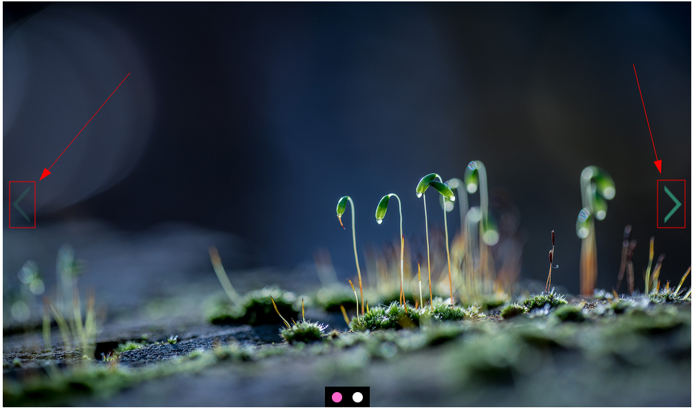
Arrow Options
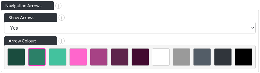
- Show Arrows:
You can enable or disable the arrows. Here is an example without arrows:

- Arrow Colour: