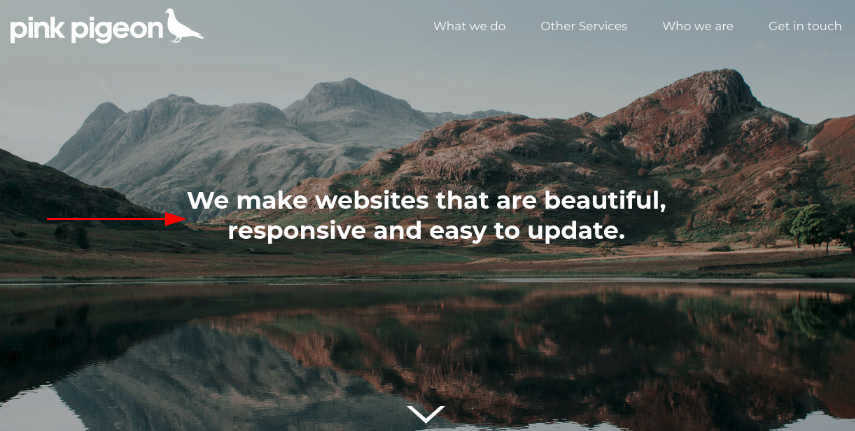
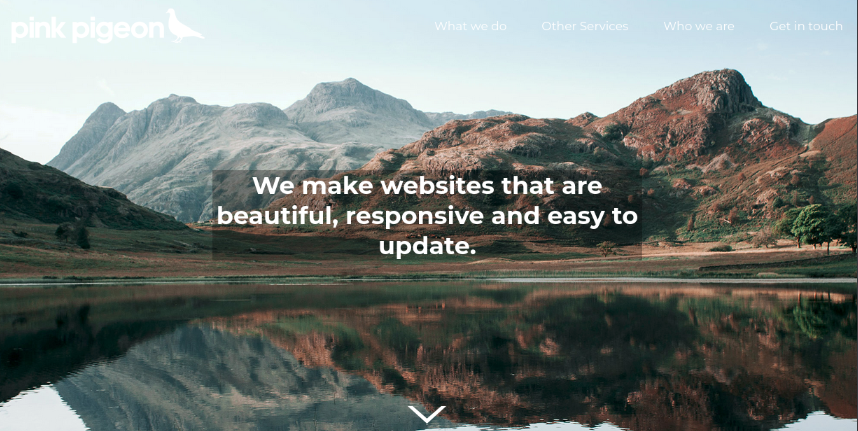
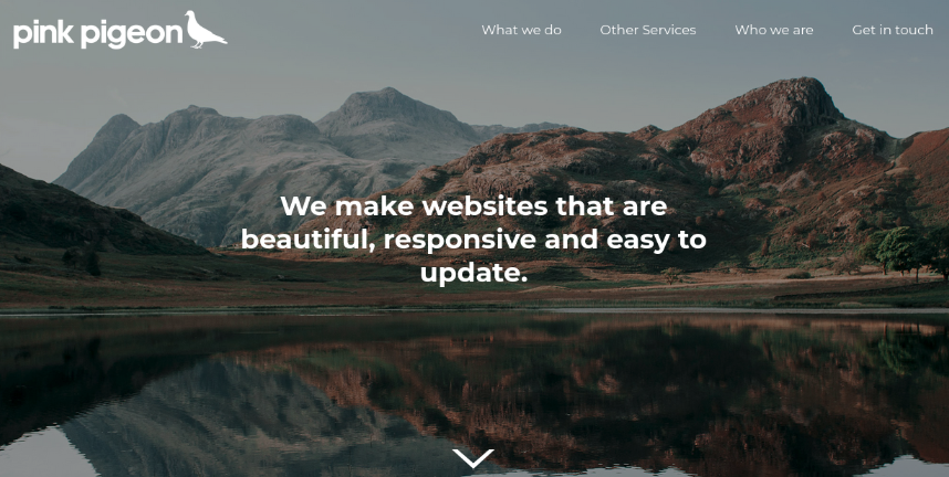
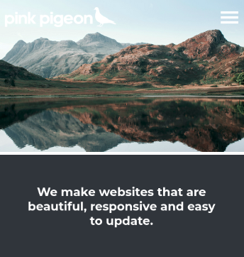
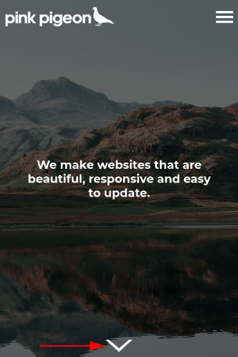
Header (Text Overlay)
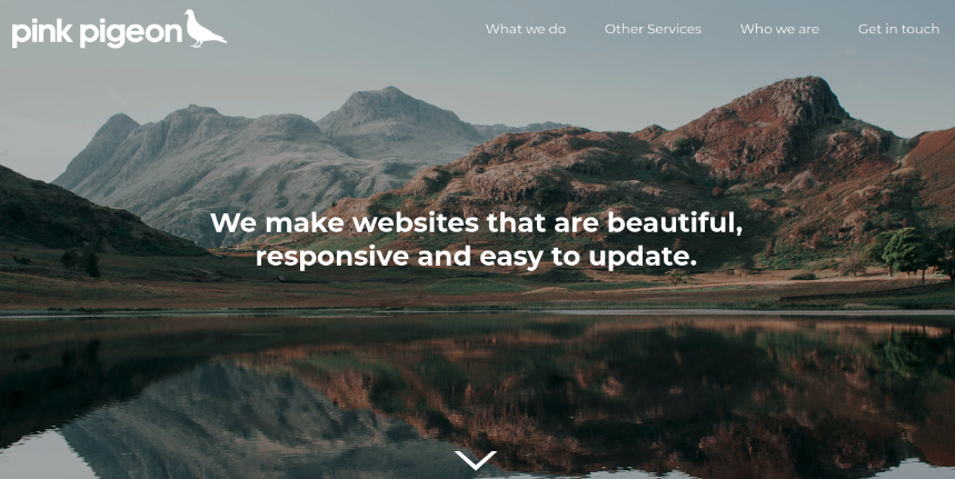
The header is a slightly more complex module. It allows for the displaying of two images, one for mobile, one for desktop resolutions (as this may work better than trying to make just one image fit such different screen sizes), though this is not mandatory.
Additionally, text can be displayed on top of the background images, such as a company tag-line. The overlay-text's position can be customised deeply.
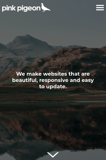
The mobile version of the header allows for three different image heights, depending on the best content fit.
The header is traditionally the first module on a page with a header, but could be placed anywhere on a site also.
Enabling / Disabling
Like all modules, this module can be enabled / disabled. Please see the corresponding section of the documentation to find out more about this functionality.
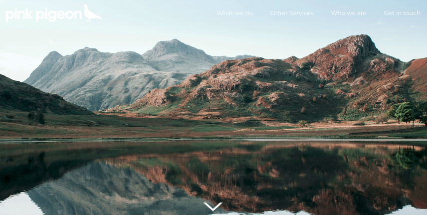
Desktop Image
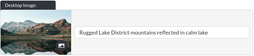
The header module's background image on desktop. This image will be shown at screen resolutions of 900px and above, typically laptops and desktop computers. Read up on changing images here.
Double Desktop Image
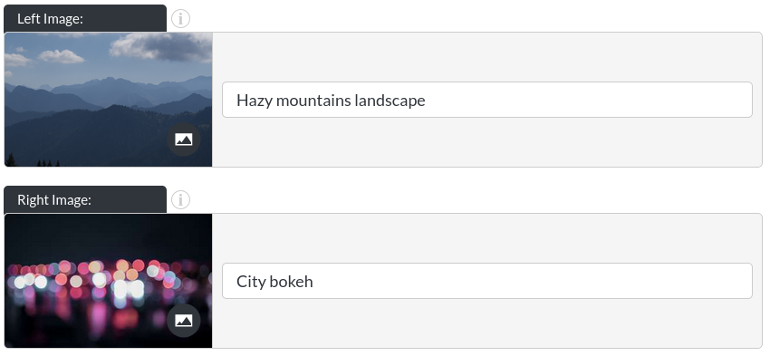
There is a double-image variation of this header, where two images can be used as the background to a header, sitting side by side. Read up on changing images here.
Mobile Image
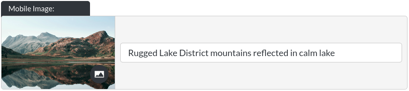
The header module's background image on mobile. This option allows you to specify an image that is shown below 900px screen width (mobile / tablet devices). It is not necessary to define a different image here. In our example, we have decided to use the same background twice. In some cases, however, it can be beneficial to provide content for mobile devices that fits the space better. This is often a question of experimentation, to arrive at the best solution for your website. Read up on changing images here.
Overlay Element
The overlay element sits on top of the header's background image:
Enabling the Overlay

Here, the overlay can be switched on or off.
on
off
Overlay Text
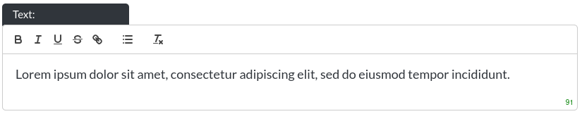
The header module's overlay text. Please note that this is a rich text field. More info on that here.
The character limit for this rich text field is 100 (most rich text fields are not this limited), due to the amount of space in the header being quite limited.
Desktop Font Colour

You may customise the font colour of the overlay text.
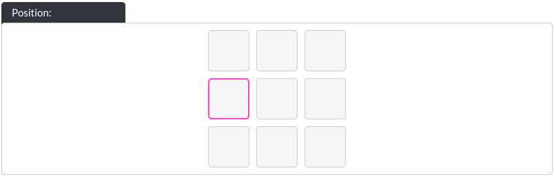
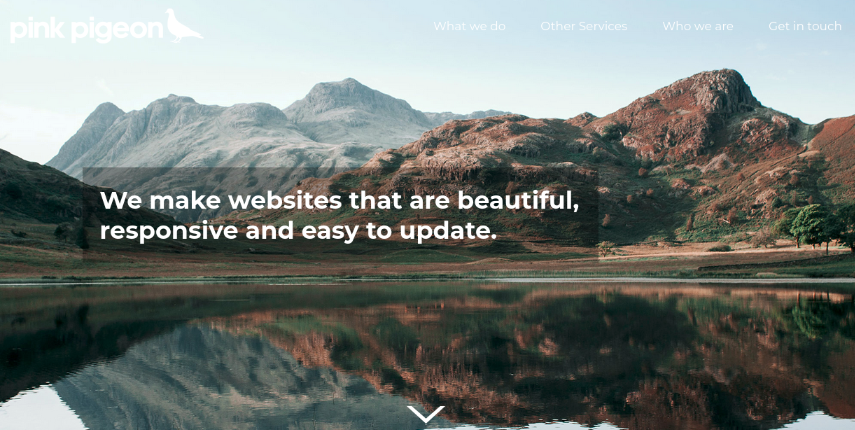
Overlay Position
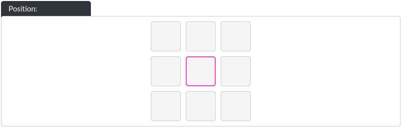
The overlay can be placed in any 9 sectors of the header. Please note that on mobile, left / right placements are replaced with a central placement. Thus, only top / middle / bottom placements are taken into account on mobile. This is due to the narrow screen widths of mobile devices.
Left Middle Placement Example
Left Middle Placement Online

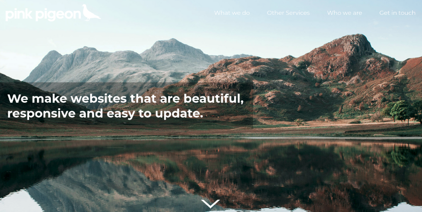
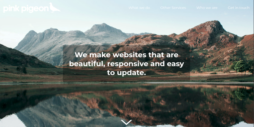
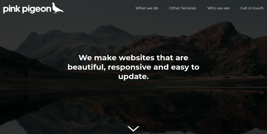
Tint Area

In order to increase the legibility of your text overlay, you can add a tint immediately behind the text, or covering the entire background image.
Sits behind overlay example
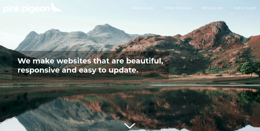
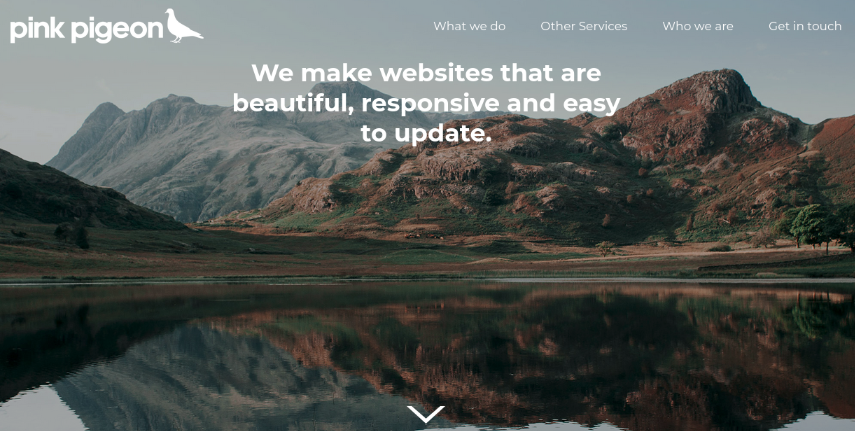
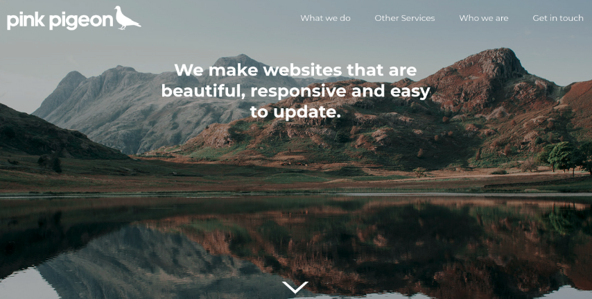
Overlay Width - Desktop

This determines the maximum width of the text overlaid on top of the header's background image (as percentage of the total screen width). The height of the overlay is determined by the amount of text.
20% Example
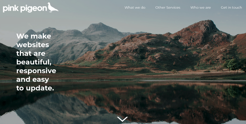
60% Example
Overlay Width - Mobile

The overlay text can have a different width on mobile, as we have found that the smaller screen-sizes of mobile devices need special consideration.
Overlay Side Margin

This determines how far the overlay text will be from the edge of the screen (as percentage of the total screen width) when you have chosen one of the left or right squares in the overlay position section.
0% Example
10% Example
This option takes into account the width of the overlay tint, so long as the tint is just behind the text (with the ‘overlay padding’ option set to something greater than 0)
Overlay Top Margin

This determines how far the overlay text will be from the top / bottom of the screen when you have chosen one of the top / bottom squares in the overlay position section. Note: This value is in pixels, not percent, due to the way websites position elements. (The side margin / width values are percentages of the screen width.)
60px Example
100px Example
Overlay Padding

The overlay's tint can have its padding customised, so long as the ‘sits behind overlay' option has been selected. This is a percentage of the total screen width.
0% Example
2% Example
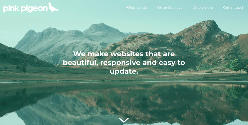
Tint Colour
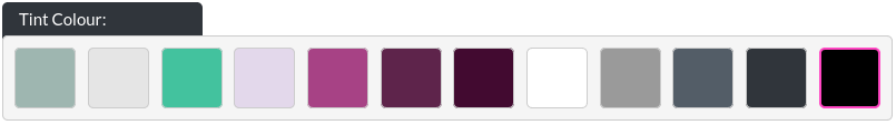
If your tint opacity is higher than 0, you may choose the colour of the tint to apply to the background image. This feature exists, as some text colours need additional contrast to the background they sit on top of. Here, you can define a tint colour to ‘knock back' the background image, giving more emphasis to the overlay.
Green Tint Example:
Tint Opacity

This determines whether you would like to apply a tint to the background image. In our example, we have chosen a black tint at 0.4 opacity (maximum is 1, minimum is 0, i.e. no tint), to ‘fade' the background somewhat, giving more contrast to the overlaid logo.
0.4 Example
0.8 Example
Mobile Image Shape

Because mobile devices have such a wide range of screen sizes, and there is such a variety of imagery that could be used with the header, we allow for three different aspect ratios of header background images below 900px screen width (which is a typical phone / tablet resolution).
Portrait Example
Square Example
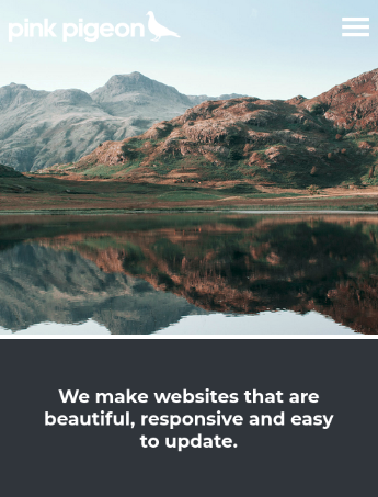
Landscape Example
The Square and Landscape options take into account the module gap value (between the header background image and the text part below), as defined in Essentials.
Mobile Background
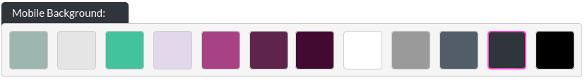
If the mobile image shape option is set to either Landscape or Square, the "Mobile Background" option appears. With Landscape or Square mobile image shapes, the text overlay moves below the (mobile) header background image, into its own area with a customisable background colour.
Mobile Font Colour
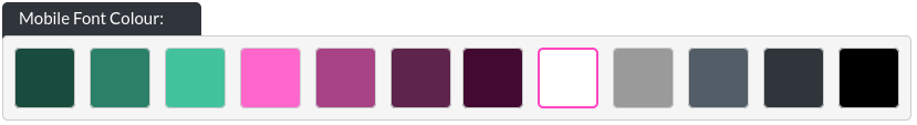
If the mobile image shape option is set to either Landscape or Square, the "Mobile Font Colour" option appears. With Landscape or Square mobile image shapes, the text overlay moves below the (mobile) header background image, into its own area with a customisable font colour.
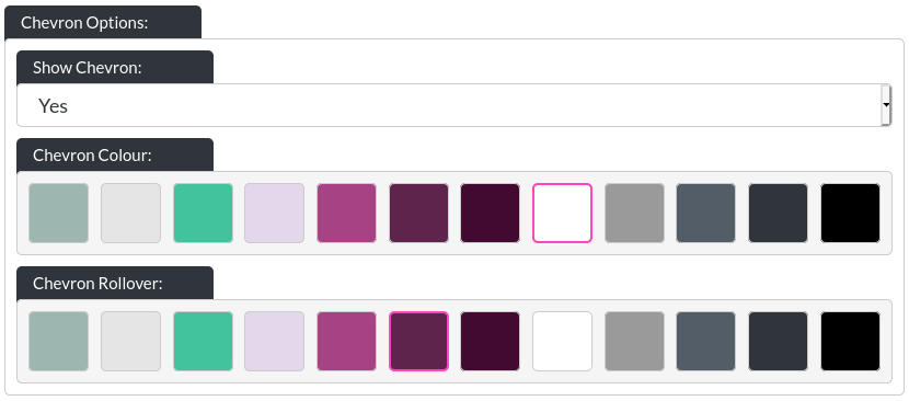
Chevron Options
The header chevron is a clickable item, which automatically moves the page down to the module below the header. The chevron is displayed for the following configurations:
- Mobile image shape: Portrait on desktop and mobile
- Mobile image shape: Square on desktop only
- Mobile image shape: Landscape on desktop only
This is the chevron:
The chevron colour and rollover (when a visitor hovers over the chevron, this is the colour it will be) colour can be customised as well.