Menu and Navigation
Here you can add, remove or change the items shown in the main navigation (or menu) of your website. You will also be able to decide what the menu itself looks like.

Logo
This is the logo of your website. Typically situated in the top-left corner. Here you may upload images in .GIF, .SVG or .PNG format, with or without transparency (.JPG works as well, but this format does not support transparency at all). We recommend using .SVG, as this is a screen-resolution independent format which always looks good (say, on retina-style iPads, as well as 4k monitors or really low-resolution mobile phones.)
Image upload size is limited to 2MB, and images above 512kb will be compressed by our system, to ensure your website stays fast for all users.
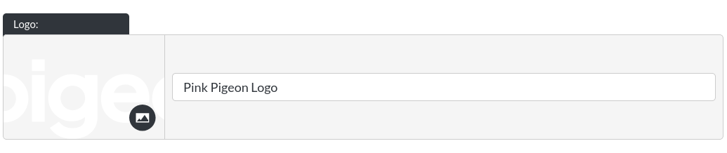
Menu Items
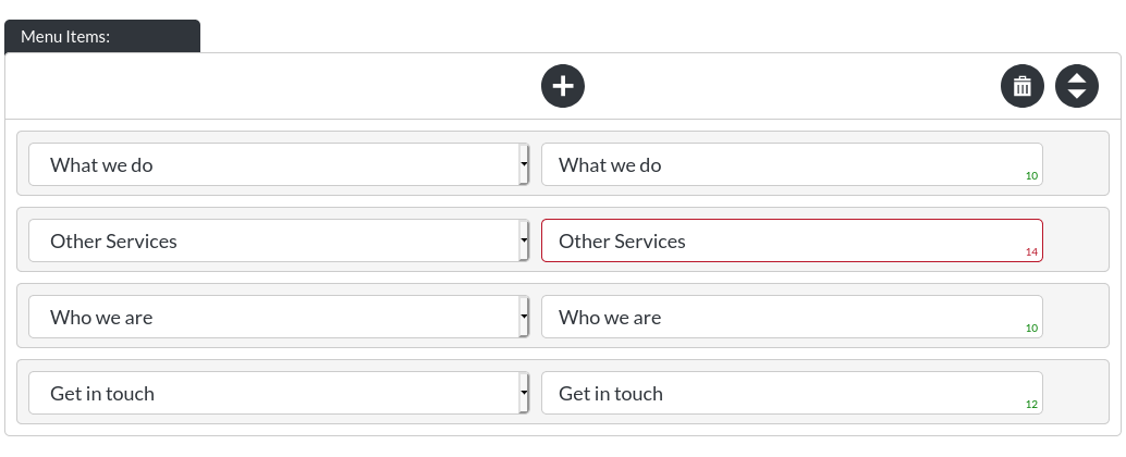
As you can see by the red outline around "Other Services", we have decided to exceed the character-limit in this one instance, as it did not negatively affect the design of the navigation items on our site. Generally we would discourage this, as we have set these limits to ensure that all menu items fit. (For example, if your menu items contained a lot of wide letters, like ‘w', especially in upper-case, the design, or layout of the nav will reach its limits much sooner. That is the limit we have defined using our green character count indicators.)
- Changing the name (or label) of a navigation item:

Any text you enter in the highlighted field will be the name / label of your navigation item, independently of where this navigation item leads (in this example it is coincidental that "Who we are" is both the name of the module we are linking to, and the name of the nav item.)
There is a suggested character limit of 12. You can exceed this limit as much as you like, but we cannot guarantee design consistency if exceeded.
If you do not enter any text in this field, the navigation item will not be displayed (and all other navigation items will ‘slot into place').
- Changing what a nav item links to:

The left field, when selected, will display a list of all Pages and Modules within your website. You may link to any of them from the navigation of your website. The navigation does not allow linking of downloadable files or external URLs, as this goes against best practices for websites (which in turn can result in reductions of your page rank by the likes of Google).
- Adding / removing / re-ordering nav items:
Please view the ‘General Components' - "Adding / Moving / Deleting" section for instructions on how this component works.
Font Colour

This is the colour of your nav items.
Rollover Colour
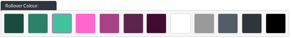
This is the rollover colour of your nav items (when someone hovers their mouse cursor over them on desktop, does not apply on mobile devices).
Nav Transparency
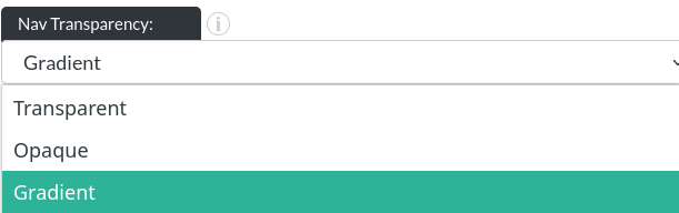
When your navigation is transparent, the first module of your website will sit behind the nav, making the nav become superimposed on that module. When this option is selected, the nav cannot be ‘fixed' or ‘stuck' to the top, which is sometimes referred to as a ‘sticky nav'.
When you set the transparency to ‘opaque', the first module of your website will start exactly where the nav ends. So, in this configuration the module is ‘pushed down'. An opaque nav can be configured to remain at the top of your website as all times, as so-called ‘sticky nav'. This can be particularly useful on long pages.
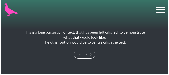
The last option is ‘gradient', which is functionally the same as a transparent nav, but a gradient can be configured for the nav items, to increase their legibility.
Gradient Colour
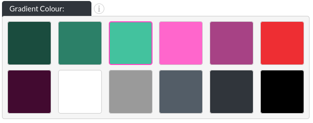
The colour of the nav gradient can be defined, here, a green gradient:
Gradient Opacity
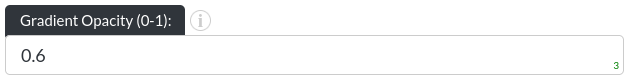
The opacity of your gradient can be set between 0 and 1 in 0.1 increments:
Opacity 0.3:
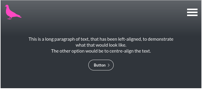
Opacity 0.7:
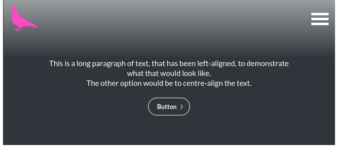
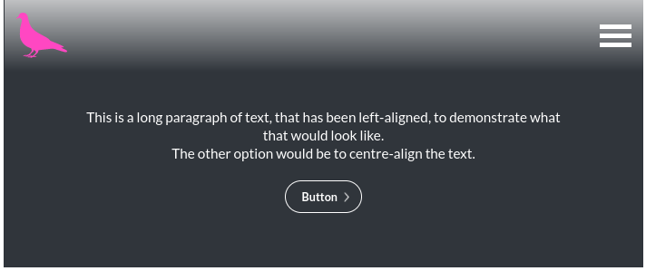
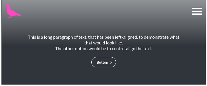
Gradient Height
The height of your gradient can also be defined, as a multiple of the original nav height. This accepts values of 1-10.
Height 1:
Height 3:
Persistence

The nav can ‘stay on top' at all times, as a floating element at the top of your page. This is useful for saving mobile users having to scroll back up to reach other sections of your website.
Height

The nav can be slim or tall, depending on your preference.
Desktop Style
The reason this item is called ‘Desktop' Style, is that this option only affects how the menu is shown on larger browser window sizes (desktop computers, with the browser in full-screen for example). If you pick the ‘burger' style, the menu will always look the way it would normally just look on mobile devices, like so:

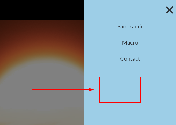
Mobile Overlay
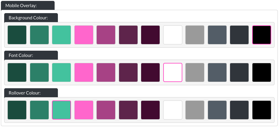
You may define three colour options for the mobile overlay (which is the menu shown when users select the menu via the ‘burger' style).
- Background Colour:
- Font Colour:
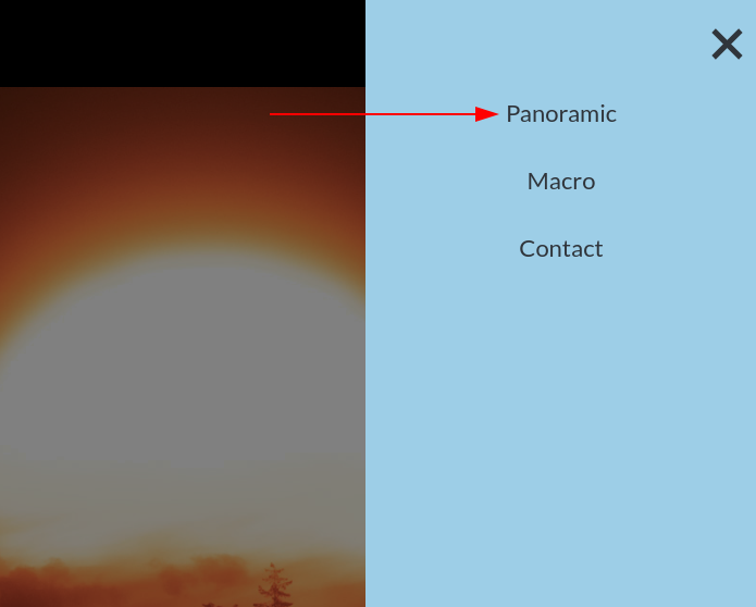
- Rollover Colour: This is the colour of a nav item in the mobile overlay, when hovered over with a mouse cursor (only on desktop, does not apply on mobile devices).