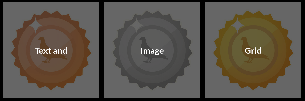
Text and Image - Grid

This is the grid variation of the text and image module, which includes a clickable text overlay.
Enabling / Disabling
Like all modules, this module can be enabled / disabled. Please see the corresponding section of the documentation to find out more about this functionality.
Link / File Download
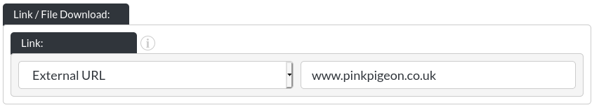
This module includes a standard file upload / site anchor / external link component.
Image
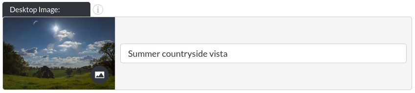
The image only text overlay module's background image. Read more about changing images here.
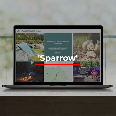
Overlay Element
The overlay element sits on top of the image module's background image:
Enabling the Overlay

Here, the overlay can be switched on or off.
on

off

Overlay Text
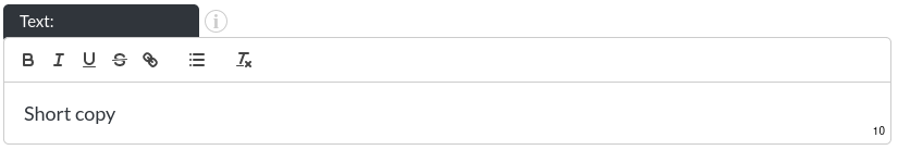
The header module's overlay text. Please note that this is a rich text field. More info on that here.
The character limit for this rich text field is 100 (most rich text fields are not this limited), due to the amount of space in the header being quite limited.
Font Colour
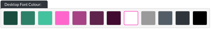
You may customise the font colour of the overlay text.
Tint Area

In order to increase the legibility of your text overlay, you can add a tint immediately behind the text, or covering the entire background image.
Sits behind text example
Covers entire module / image example
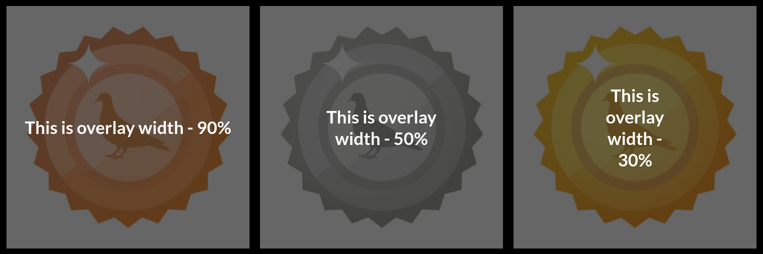
Overlay Width - Desktop

This determines the maximum width of the text overlaid on top of the module's background image (as percentage of the total screen width). The height of the overlay is determined by the amount of text.
Example
Overlay Width - Mobile

The overlay text can have a different width on mobile, as we have found that the smaller screen-sizes of mobile devices need special consideration.
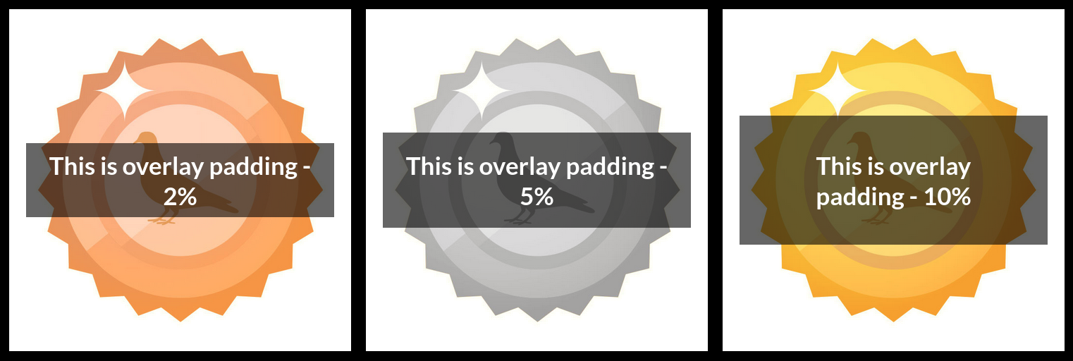
Overlay Padding

The overlay's tint can have its padding customised, so long as the ‘sits behind overlay' option has been selected. This is a percentage of the total screen width.
Examples
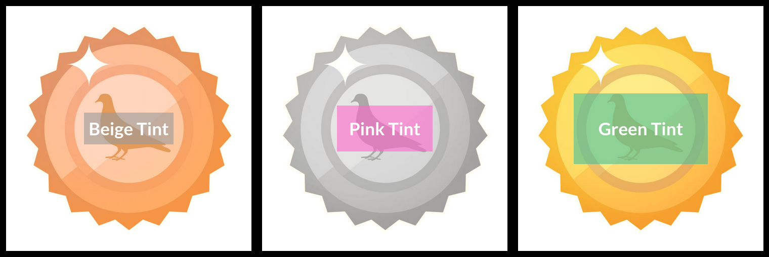
Tint Colour
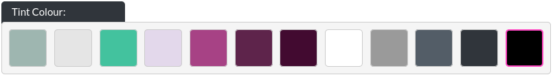
If your tint opacity is higher than 0, you may choose the colour of the tint to apply to the background image. This feature exists, as some text colours need additional contrast to the background they sit on top of. Here, you can define a tint colour to ‘knock back' the background image, giving more emphasis to the overlay.
Tint Examples:
Tint Opacity

This determines whether you would like to apply a tint to the background image. In our example, we have chosen a black tint at 0.4 opacity (maximum is 1, minimum is 0, i.e. no tint), to ‘fade' the background somewhat, giving more contrast to the overlaid logo.
Examples
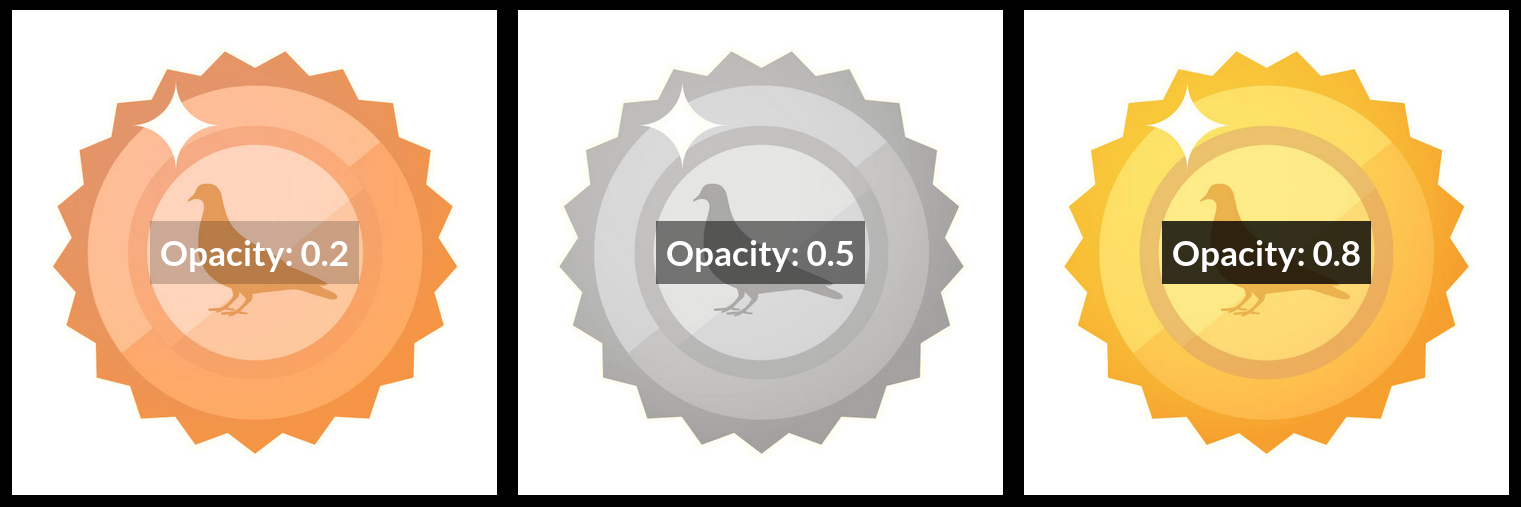
Image Zoom
This enables the zoom-on-hover functionality of the text and image - grid module.