Text and Image
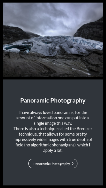
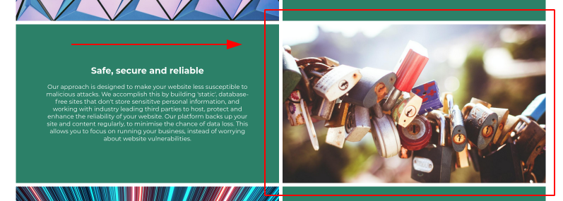
The Text and Image module is one of our most used modules. That is because most content online is just that: Pictures with accompanying text. Please see an example below:
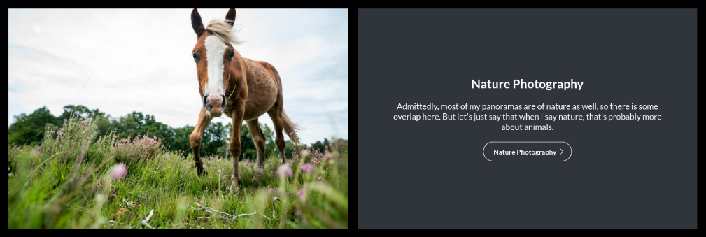
Grid Version
There is a grid variant of this module.
Enabling / Disabling
Like all modules, this module can be enabled / disabled. Please see the corresponding section of the documentation to find out more about this functionality.
Image Panel
-
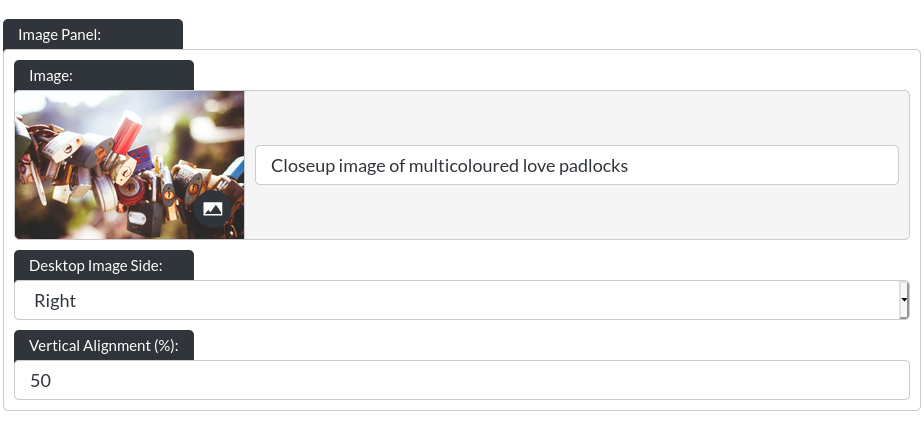
Image: This controls the image of the text module, for example:
-
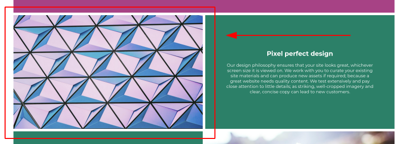
Desktop Image Side: You can ‘flip' the text and image around, for example:
Text Panel
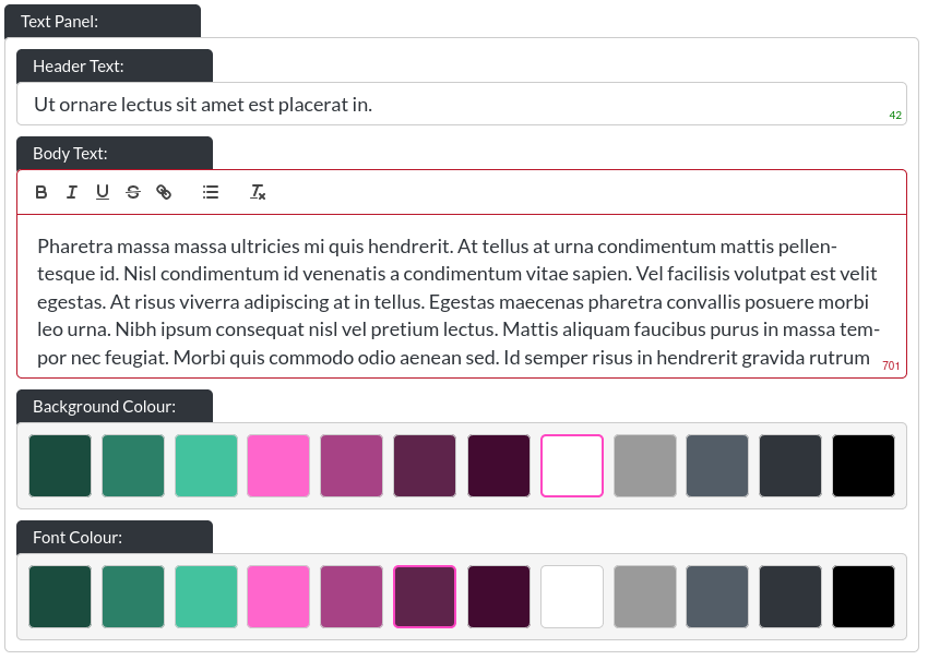
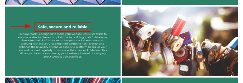
- Header Text: This is the header within a text and image module:
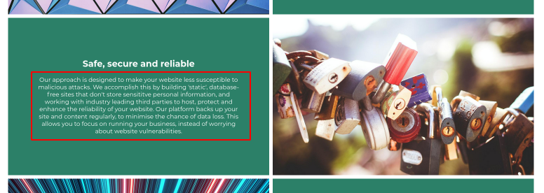
- Body Text: This is the body text within a text and image module:
Please note that this is a rich text field. More info on that here. On desktop resolutons, this field has a height limitation, to ensure clean layouts, which is why the character limit is 450.
You can leave any text field blank, and the website builder will adjust the layout to make the remaining text elements fit. You could even leave all text out, if desired.
- Background / Font Colour: You can control the background colour and text colour of text and image modules using these controls.
If a small or large module-gap was selected, the text and image module takes this into account, see Module Spacing in Essentials for more information.
Button
Please refer to the CTA / Button section for more info about the button.
On Mobile
The Text and Image module adapts to smaller resolution screens by flipping from a horizontal to a vertical arrangement, with the image always sitting on top (that means the ‘Desktop Image Side' has no effect at tablet resolution and below). The text-panel of this module is not height-limited on mobile.