Testimonials Standard
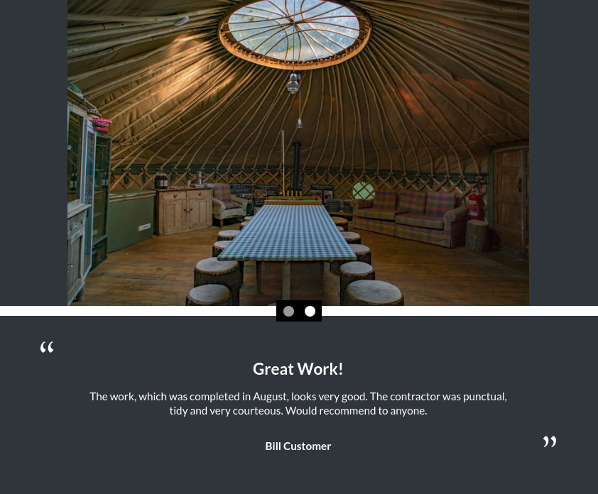
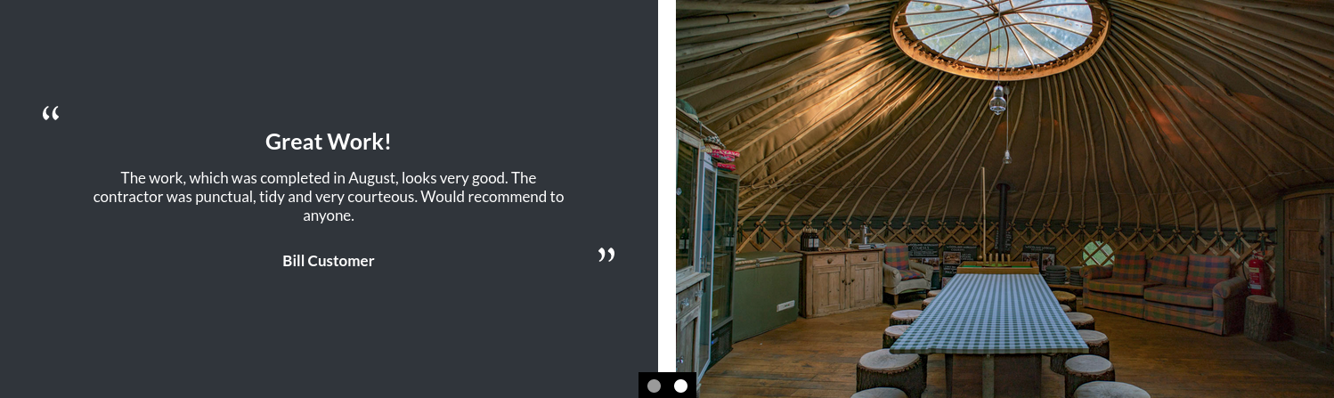
The standard testimonials module includes a text panel and image panel. The text panel consists of a heading, body text and smaller, bold customer name. There is a text-only variant of this module.
Enabling / Disabling
Like all modules, this module can be enabled / disabled. Please see the corresponding section of the documentation to find out more about this functionality.
Testimonials Panel
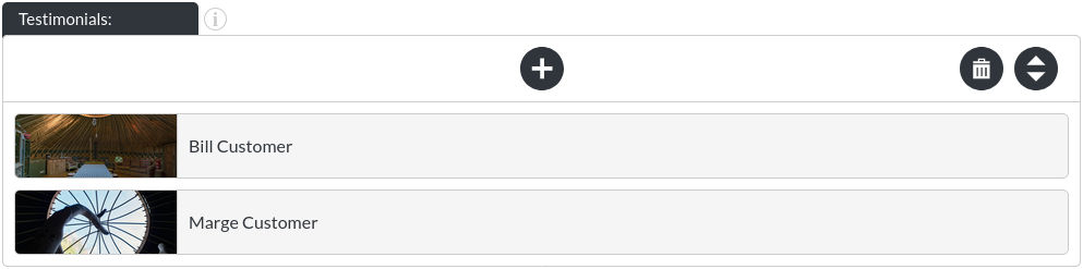
A testimonial item consists of the following items:
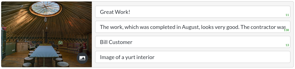
- Header
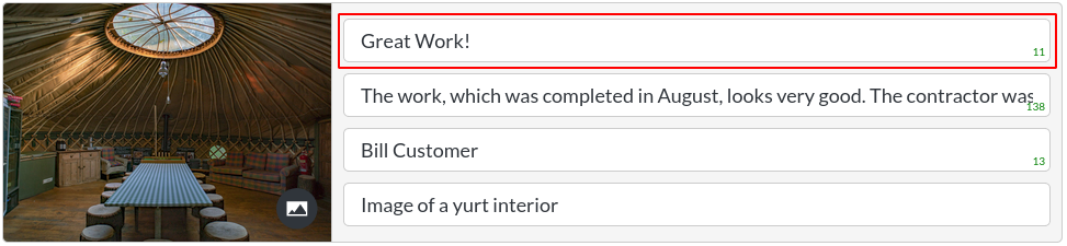
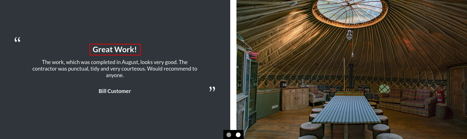
- Body Text
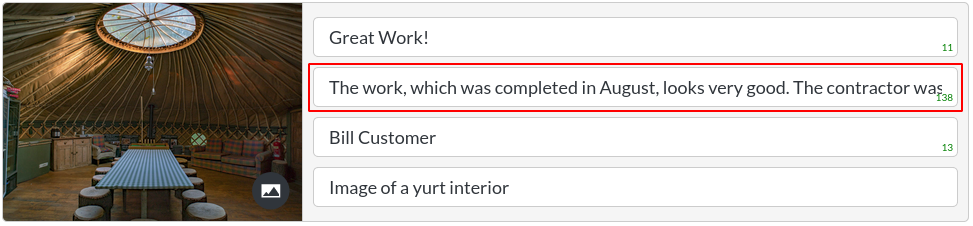
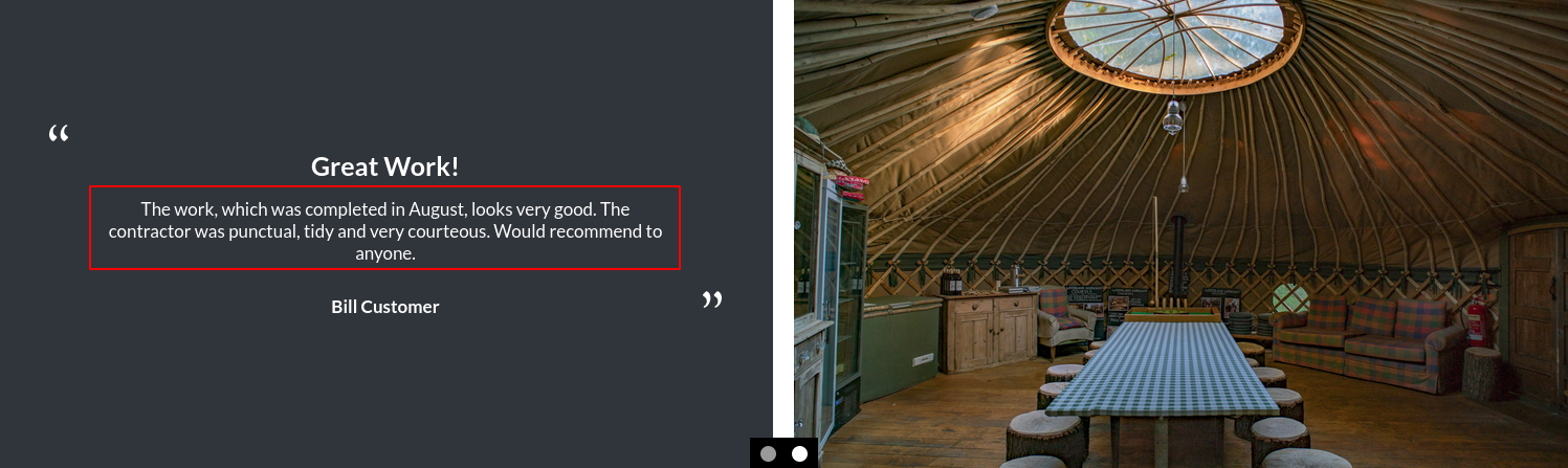
- Customer
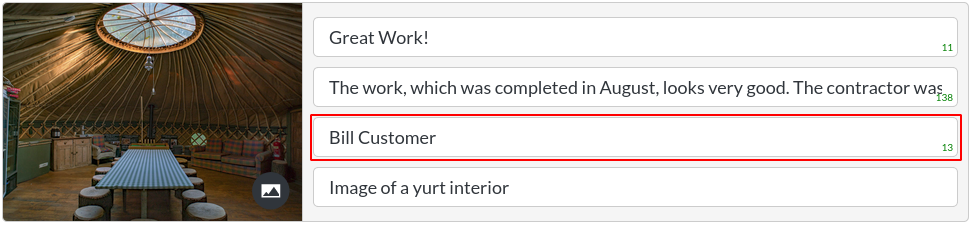
- Alt Text
The image alt text is a placeholder, which is shown if the image can't be displayed. It is also essential for screen readers, which would read this out to vision impaired users.
Image Fit

-
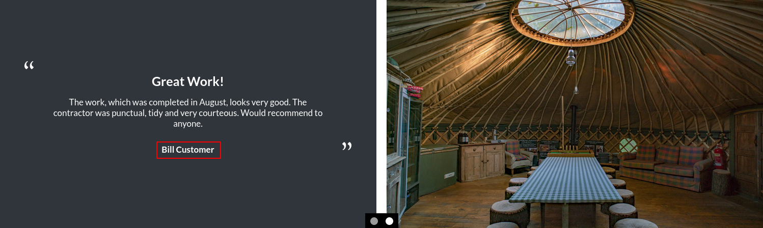
Cover: This option will ensure that the image is always filling the space it sits within, at the cost of some of the edges being cut off for certain screen resolutions. This is the option used throughout this page.
-
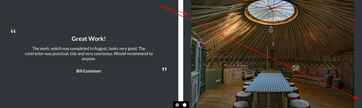
Scale-down: This option will always make the whole image visible (which is useful for portrait or very wide images), but it means that there will be a visible background colour in areas of the module that the image does not cover, as shown:
Auto Scroll:

The testimonials module scrolls through testimonials at a 4 second interval by default. This can be turned off.
Scroll Interval:

This is the scroll interval in milliseconds.
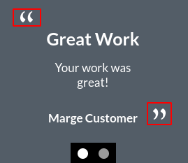
Quotation Marks

This allows for control over the quotation marks, shown here:
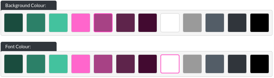
Colours
The Text Only module allows you to change the background colour and text colour of the module.
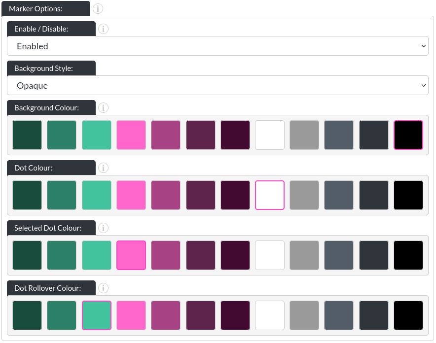
Marker Options
-
Background Style: There are three options for the marker backgrounds. None:
 / opaque (with a customisable background colour):
 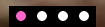 and ‘gradient', which you can see above.
 -
Dot Colour: This allows you to change the colour of the dots in their initial state (in above images, that is white).
-
Selected Dot Colour: This allows you to change the colour of whichever dot corresponds to the image that is currently showing.
-
Dot Rollover Colour: This is the colour of any dot that the user's mouse is hovering over.
Navigation Arrows
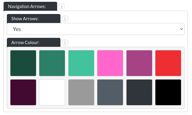
- Show Arrows: This option allows you to turn on or off the navigation arrows of the testimonial module.
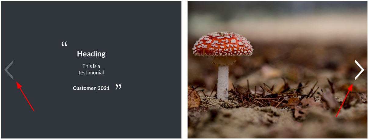
- Arrow Colour: You may specify the colour of the arrows to your liking.
On Mobile
The testimonials module changes shape on mobile, to stack vertically, with the markers being placed in the middle.