Contact
The Contact module turns into a contact form on your website:
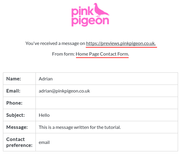
When a visitor to your website fills in the form, you will receive an email including all the info that was filled in on the form.
Enabling / Disabling
Like all modules, this module can be enabled / disabled. Please see the corresponding section of the documentation to find out more about this functionality.
Form Name

You can name your forms (at pinkpigeon.co.uk, for example, we have 6 contact forms, one for each section). The website builder will include this name when emailing you, so you know what section of your website a visitor contacted you from.
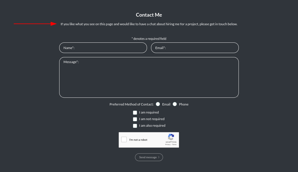
When we email you, the form name will be included in the message (please note that the originating URL is also included in the email, so you know it came from us):
Contact Email
Here you may select from one of the pre-defined email addresses you would like to use for the contact module. Different tiers of users get access to different numbers of email addresses.
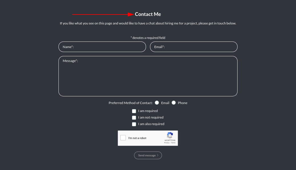
Header Text

This is the header text in the contact module.
Here it is online:
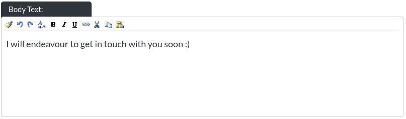
Body Text
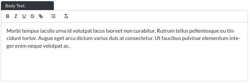
This is a rich body text input without a character limit.
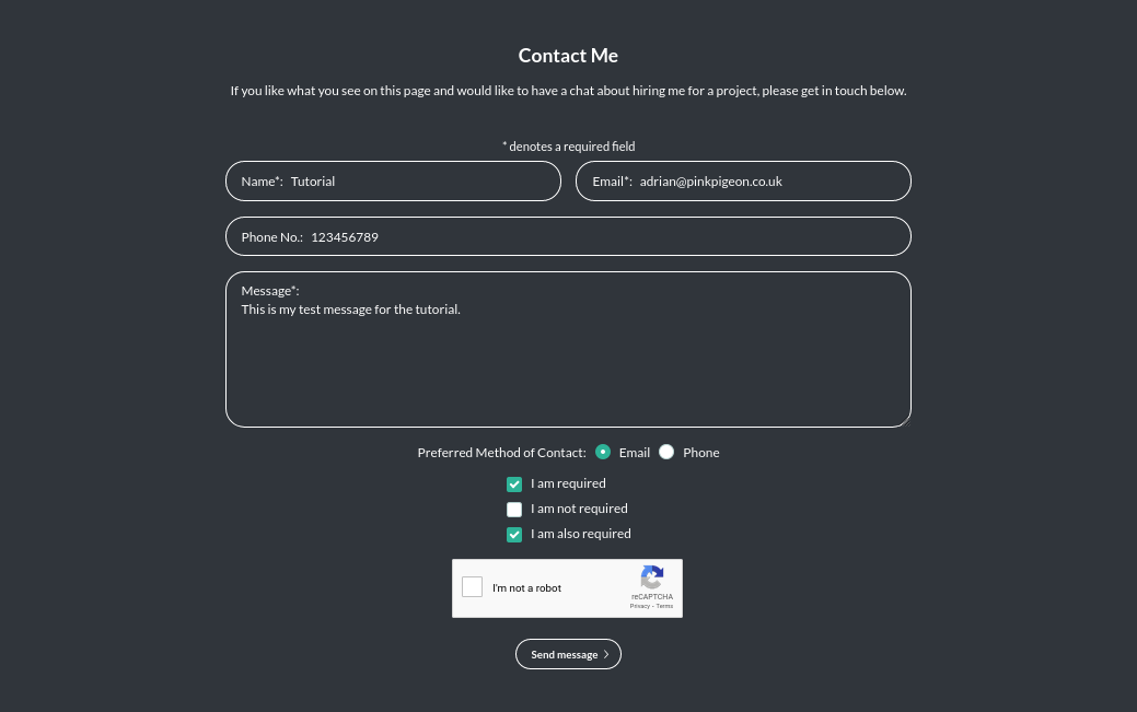
Here it is in the module:
It is still a good idea to limit the amount of text somewhat, as the design of the site may stretch too far in trying to accommodate a large amount of text
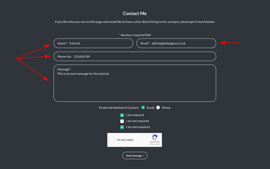
Form Fields
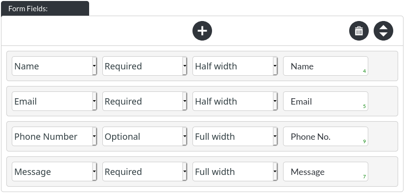
Each item consists of four items:
- The type of form field, which can be Name, Email, Phone Number, Date, Message, Optional (Text), Time.
-
Whether the field will be required (marked by an asterisk), or not.
- Whether the field will be half-width or full-width. The form in this tutorial has two half-width fields (Name / Email) and two full-width fields (Phone / Message). This allows for composing fields according to the amount of text they are expected to hold, or simply aesthetics.
- The label of the field, e.g. what it will be called in the form, visible to the user.
Contact Method

You may choose whether to give your visitors the option of indicating how they'd like to be contacted.
Here it is online:

If you have enabled the preferred contact method option, double check that you have form-fields corresponding to ‘email’ and ‘phone number’.
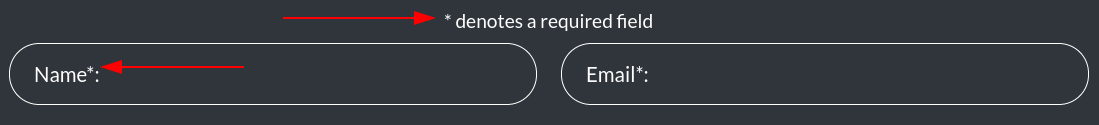
Requirement Asterisk

You may choose whether to indicate required fields with the asterisk, or not.
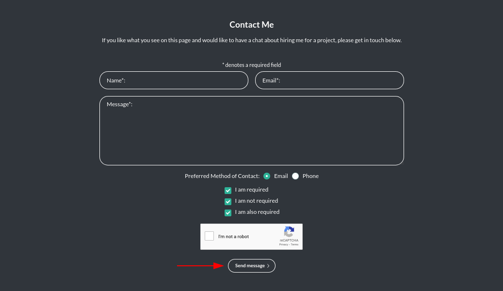
Legal Confirmations
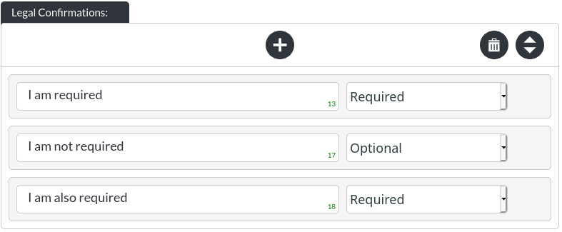
The legal confirmations are part required (for GDPR reasons) and part optional. Legally, you cannot gather the information people submit as part of contact forms without first making your visitors confirm that they are happy for you to do so.
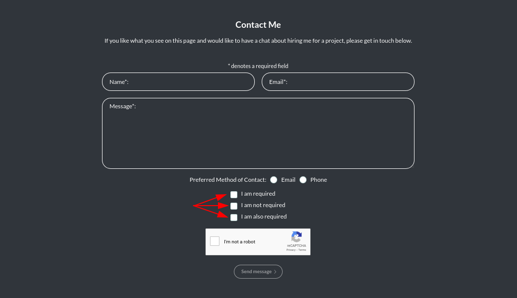
The ‘submit' button of the form will only become enabled once all required legal confirmations have been checked. (The opacity of the submit button changes, to indicate this to your visitors.)
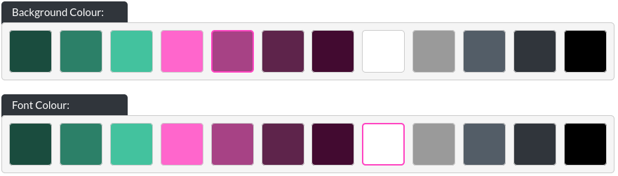
Colours
The Contact module allows you to change the background colour and text colour of the module.
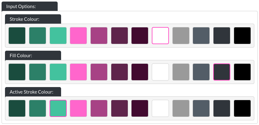
Input Options
-
Stroke Colour: This is the colour of the border around the input field.
-
Fill Colour: You can determine the fill colour of contact fields (please make sure to use a font that has a high contrast with the form field).
-
Active Stroke Colour: When your visitors select a form field, this colour will be used as a highlight, replacing the border colour.
Button
This is a special button / CTA section, as this button only submits the form. Therefore, fhe function of it cannot be customised (and file downloads, or external URLs are disabled). You can still customise the text of the button and all colours, as described in the CTA / Button section
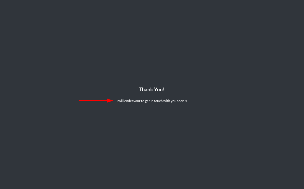
Confirmation Header Text
The confirmation header text is shown on the ‘Thank You'-screen, which follows a successful form submission.
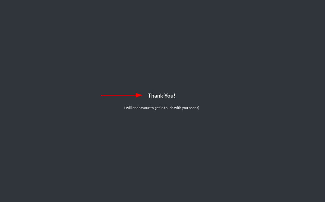
Confirmation Body Text
This is a rich body text input without a character limit.
The confirmation body text is also part of the ‘Thank You'-screen.